Kino Creative

How We Built a 3D Table Customiser for an Online Shop
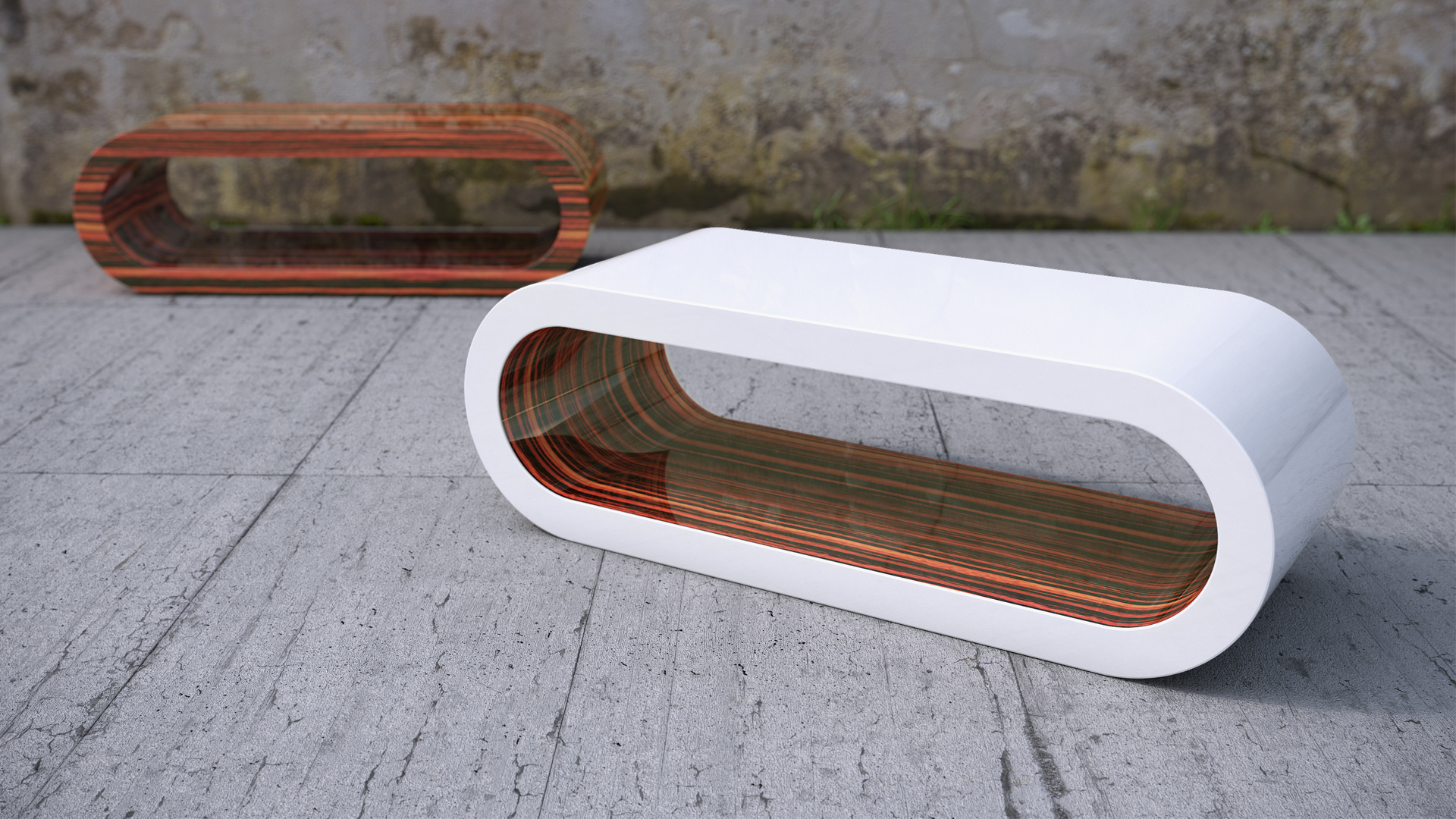
Sometimes the success of a project relies on the correct choice of technology. This proved to be the case on the latest project we worked on for Zespoke, a manufacturer of customisable designer tables based in Belfast. We used WebGL to build them an interactive 3D table customiser.
We’ve moved offices

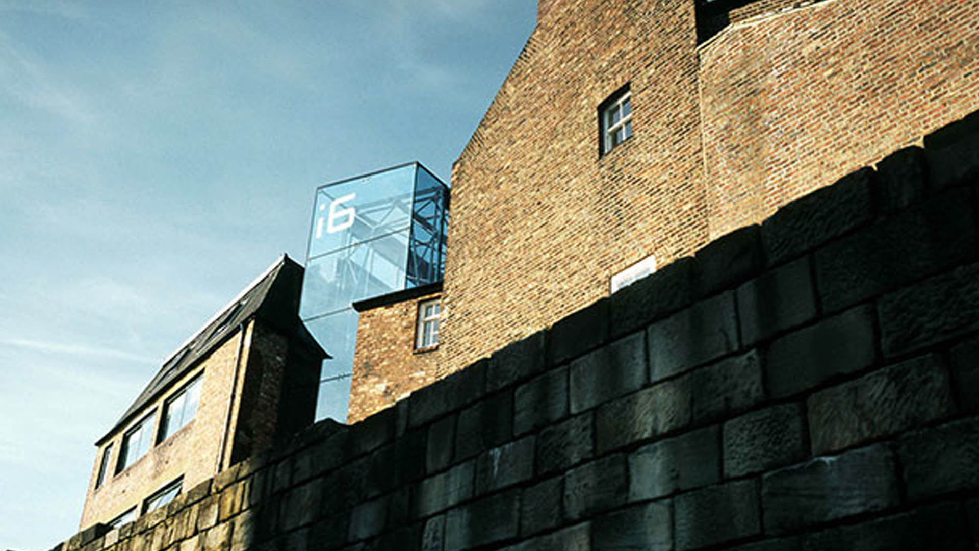
We’ve just moved to the i6 Business Centre in Charlotte Square, Newcastle city centre. Please note our new contact details below.

Responsive Infographics – The Benefits & Our Infographic Work

The word Infographic is one that is now seen and heard of constantly throughout the web. It could be seen as a ‘hot internet trend’ by some, but there is no denying an infographic or data visualisation’s value in regards to consuming information online. To prove this, we decided to give you the facts on infographics… and what better way to show them than in an infographic?

Kino Creative Brand & Site Redesign

Over the last few months here at Kino we have been going through the long and sometimes challenging process of going through a full rebrand and site redesign. It’s never an easy task for any company, but it is probably even harder for a creative and digital company. With so much other work for clients that always takes priority, going through a brand change can seemingly take forever, and with so many creative minds and ideas floating around the office you never quite know if everyone will be able to reach a decision and be satisfied with the end result… but we’ve done it! And I’m here to talk about it.

An Interview With… Emma Routledge

Emma Routledge Headshot

Emma is a new designer at Kino, and a very good one at that. Emma specialises in front end web design and coding, and has recently been involved in projects which have seen her design up logos, visual brand frameworks, fully responsive websites, Powerpoint documents, infographics (also responsive) and whitepapers. Over the last few months Emma has worked with Network Sundays, Criteo, and Phoenix Datacom.

Responsive navigation

As responsive design grows more and more popular, it’s hard to come across a website which isn’t responsive; although, when you do you sometimes can’t help but be a little bit disappointed. Getting the navigation right on responsive design can be tricky and can sometimes leave users – particularly those on mobile devices – at a loose end. So, with it’s ever growing popularity, it’s well worth looking into the many ways to take care of navigation for smaller screen sizes to find the one that’s right for you. In this article you will find 5 examples, one of which may be just right for you.

Large WordPress sites: big brand sites using WordPress

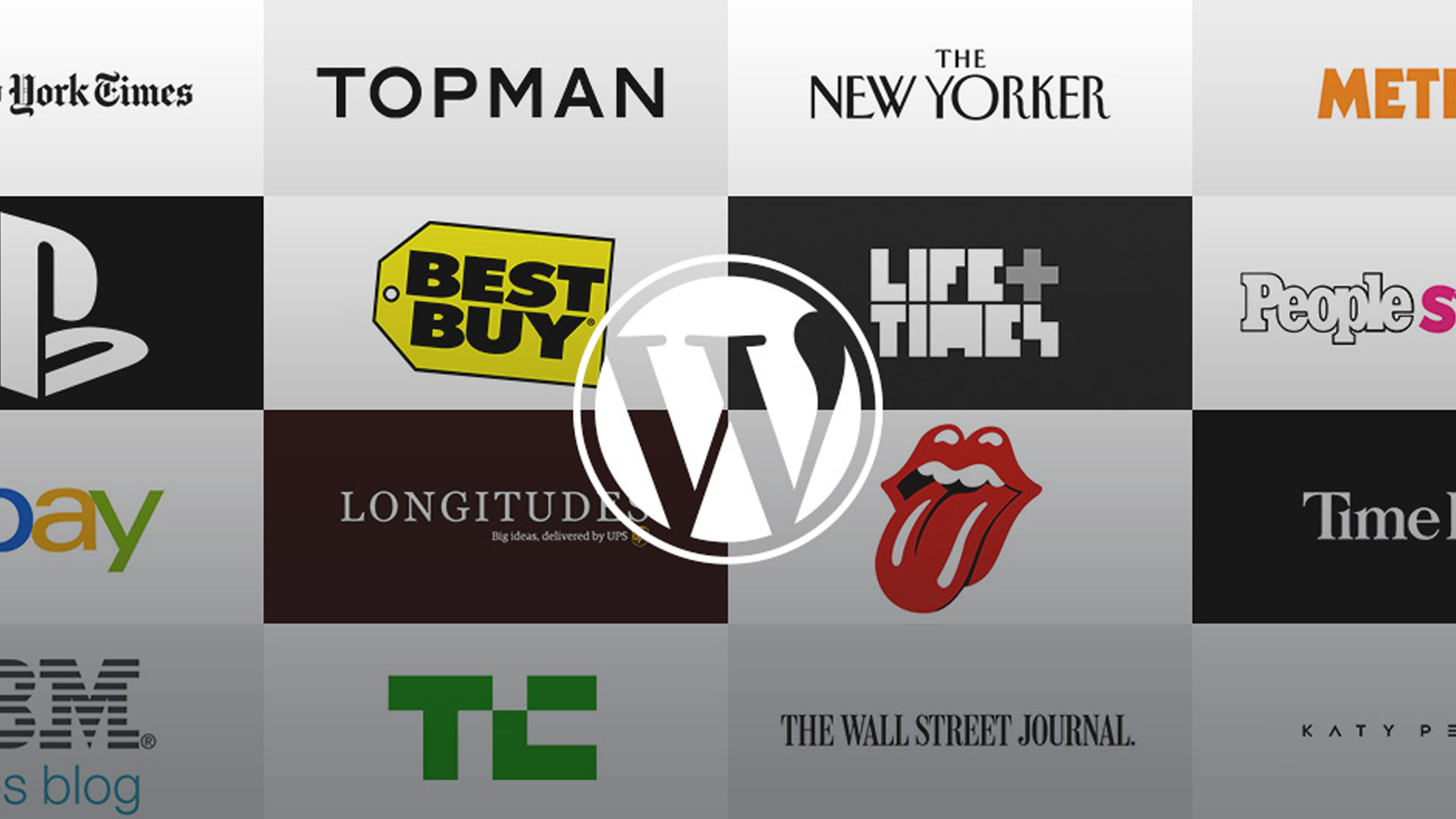
We take a look at some of the largest blogs and websites powered by WordPress, some of which may be surprising! If you thought WordPress was limited to small websites and blogs, think again. These large WordPress sites are used buy some of the worlds biggest brands to promote their content.

WordPress Security Update Package

You want to protect your site and keep its content safe, right? Of course you do, especially with all these recent security scares going on. Have a read about the new WordPress security update package we are now offering and the ways which it will protect your website from those crafty hackers.

Responsive website design: The benefits

Want to know the reason why you may be losing customers? And how to solve it? Read our simple guide to responsive website design, which tells you how to keep up with all the latest trends and could be your step to success.