The Brand
Before going through a massive change like this it’s essential for any company to get a handle on what their brand is. If we don’t know, how can we develop an identity and website that are both cohesive with each other and are the most accurate representation of the work we do on a daily basis.
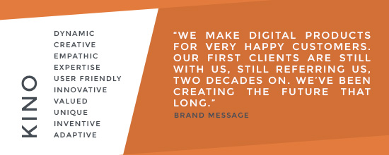
Getting this nailed down was incredibly important and so our brand framework was revised and updated. Through how we represent ourselves online we want show that we are a digital company who have strong connections to our clients, and that we have expertise in creating projects that prioritise on the client and its customers, and do so by creating dynamic and innovative designs.
The Identity
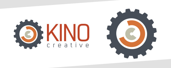
Before beginning development on our new identity an important part of generating ideas was analysing the identity we had at the time. The largest issue with the current identity was how it was almost too generic. Cogs are iconography that can represent our company very well, however it could also represent a million of other companies just as well, and not just in the digital sector. You strip the “Kino Creative” away and place the icon in another environment, no one is going to immediately recognise it as Kino, or even a digital or creative brand. This issue was what spearheaded the development into our new identity.
DEVELOPMENT
Font choices for our new website had already been selected ahead of time, so the first route was taking our new heading font and creating a logo from it. While working on the website alongside this we decided on an interactive shards-like theme that would be carried across the website, so we wanted to incorporate this into the branding.
![]()
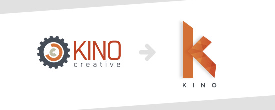
We combined that idea with our new heading font, and while it looked great, we began to revisit the issues we had in the original identity. The shard pattern that appeared on the logo looked interesting and unique, however in mediums like print where the logo may have to be in a block colour to save print costs it looks even more generic than the current identity. From this we tried different variations of the logo by removing parts or “shards” of the text, but scalability was still an issue. This logo needed to be accessible across ALL mediums and screen sizes, the best way to ensure that was to create an emblem. An emblem allows the logo to be scaled up and down without losing any detail or legibility, while also taking up minimal space on a screen. We took the shard pattern from the original idea and developed a unique ‘K’ emblem from scratch.
![]()
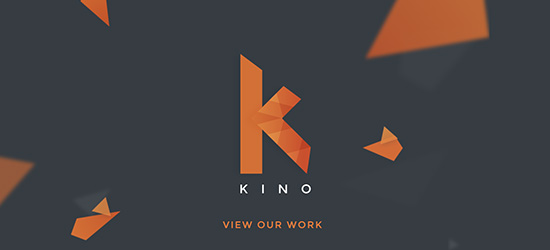
This new emblem logo means that whether our company name is listed alongside, below or not at all it is still a unique design, and if it’s used without the shard pattern it is still recognisable to all as the Kino brand.
![]()
A second key point that we wanted to make for our branding was to make it adaptable. A feature of our new site is highlighting the four different services that we offer, and these are represented by different colours. We wanted our new logo to change in reference to each service, but still be true to its original form. This new logo allowed us to simply change the colour for each service.
THE FINAL RESULT
Our new identity is one that overall represents our company and our key core values and brand message more accurately than our previous. It is simple, clean, unique and modern, yet will age well among the constant growth and trend changes of the technology industry. It represents a slick, digital company which has the utmost focus on legibility and adaptability across all mediums and devices, and can be recognised across a wide range of business sectors.
The Website
Deciding to redesign a website can open a can of worms, but like mentioned at the start, a digital company deciding to redesign their own website? Expect the biggest can of worms imaginable… but this isn’t a bad thing. As soon as the decision is made countless ideas can spill out from every direction in an instant, it will feel like chaos and it will seem impossible to come to any decisions or direction, however through spilling out all the ideas there was one thread we found that connected them all, interactivity.
We pride ourselves on being able to create projects that engage a user and involve them, that are also importantly accessible and are through different mediums and devices, whether it is a website, infographic or animation, so this needed to be shown through our website. Our previous website included interactive qualities, but it wasn’t practical, and it also didn’t truly showcase what we can do as a company. We wanted our site to be fun and entertaining but the information still needed to shine through, otherwise why is the user visiting in the first place? For this new design we opted for subtle animation and interactive elements that complimented the information throughout the site.

This is where the main shard idea was born. These shards that represent our new identity were a way to include interactivity on the website without distracting from the content on the page. When you visit our new site the first thing you see is something huge and interactive that engages you into the site. It’s something fun and cool that you can play around with which gives a sense of what our company is about, but then you delve further into the site where the shards are then used more sparingly so the focus is on what’s most important, while keeping cohesion.
Through the revised brand framework we have included a lot more information on the site. On our previous site it was hard for the visitor to find the core information quickly, and when they did there wasn’t a lot of it, and so it seemed almost like a wasted journey. Here now we have created strict areas of the site, which you can find through our improved menu, that describes what we do, the services we provide and how to contact us… however we wanted our work to do some talking too.
It’s no secret that images catch a person’s eye more than text does, they are harder to ignore. Text asks you to take notice, imagery makes you, and succeeds. This new site brings a new revamped portfolio section. Our previous portfolio had our clients listed with brief information telling you what we do for them, now… we show you what we do.
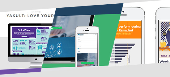
We show you what we design and develop, we show you that it crosses platforms, we show you that it looks great up close, we show you that we have the evidence to back up what we claim as a brand. The short and snappy information on each project is straight to the point, and just allows you to browse through the visuals, along the way reading what our clients had to say.
So…
This new website is a huge step up from what we had previously, and all of us here at Kino are so positive about how it turned out. It was a long process full of complications along the way but I think we’ve been able to achieve something great, which is the perfect representation of what we do and who we are as a company.
You can stop reading this now, go take a look at the site.